The main aim of brand guidelines is to make certain that all parties use the brand elements consistently. Brand guidelines provide information and tools and set the standards for using brand names, logos, typefaces and other design elements in advertisements, brochures, newsletters, packaging and online communications. Brand guidelines are extremely important towards the consistency and success of the brands aesthetic. Additionally, I read an article titled '21 Brand Style Guide Examples' in order to gain some more knowledge of examples of brand guidelines used successfully.
'Picture the most recognizable brands you can think of. Chances are, you've learned to recognize them because of the consistency across the messaging -- written or visual -- these brands broadcast. The same brand colors are reflected across them. The language sounds familiar. It's all very organized and, while not rigid, it's cohesive.' - https://blog.hubspot.com/marketing/examples-brand-style-guides
Things to consider when creating brand guidelines:
- Mission Statement
- Buyer Persona
- Colour Palette
- Editorial Style Guide
- Typography
Successful Brand Style Guide examples that I found interesting:
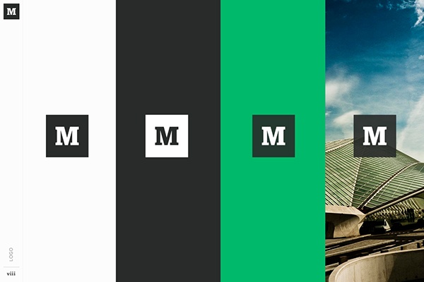
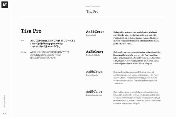
Medium: Medium emphasizes both typography and color in its brand style guide. Its guide also include details related to the company's "Purpose" and "Product Principles."


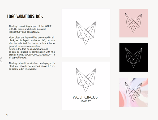
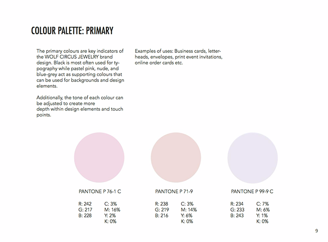
Wolf Circus Jewelry: Wolf Circus Jewelry's product is all about appearance. Naturally, the company's style guide is too. The brand's style guide includes the company's mission statement, product details, typeface, logo variations, a colour palette, and a separate set of guidelines just for advertisements.


Spotify: Spotify's color palette includes three colour codes, while the rest of the company's branding guidelines focus heavily on logo variation and album artwork. The style guide even allows you to download an icon version of its logo, which makes it easier to represent the company without manually recreating it. It is extremely important for Spotify to have a strong, consistent brand guideline as it is such a big company, the design needs to be memorable.
Netflix: As far as its public brand assets are concerned, Netflix is focused primarily on the treatment of its logo. The company offers a simple set of rules governing the size, spacing, and placement of its famous capitalised typeface, as well as a single colour code for its classic red logo. The same as Spotify, Netflix also needs to have a strong, consistent brand guideline as it is such a big company, the design is memorable and minimal.


No comments:
Post a Comment